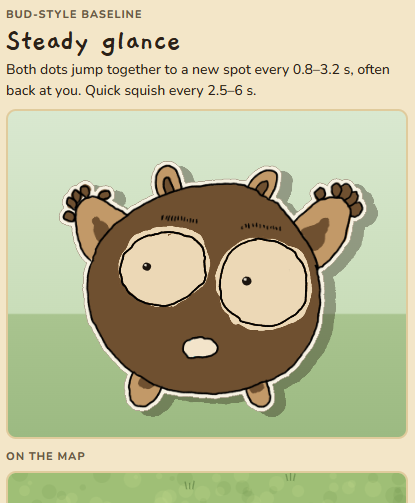
All the mobs in the game I’m making are proto-creatures, “Betas,” that never made it to the release stage of their existence. This premise lends itself not only to gameplay–the mobs quiz you about the real world, so “Ber” here wants to know about bears; where they live, where they eat, etc.–but also to my horrific artistic style.
I mean, that’s the point, though. They’re half-finished. Poorly thought out. Like crumpled up and rejected versions of Pokemon that litter the floors of Nintendo.
I’m drawing the mobs myself and using Godot to do simple hopping animations, along with blinking and a few other facial tics.
Claude can do mockups of what animations will look like and show them to you in HTML, although I do notice that the mock ups are often wildly different than the results that you get through Godot.
Now, I’m faffing around with fonts.
Even thought it’s not really all that important.
I’m just really picky about fonts and weights and sizes and spacing. I quit software engineering to study literature.
That’s really all you need to know.